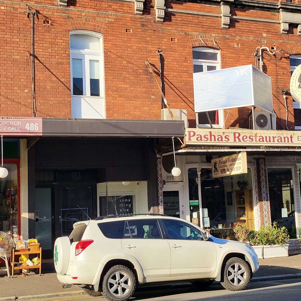
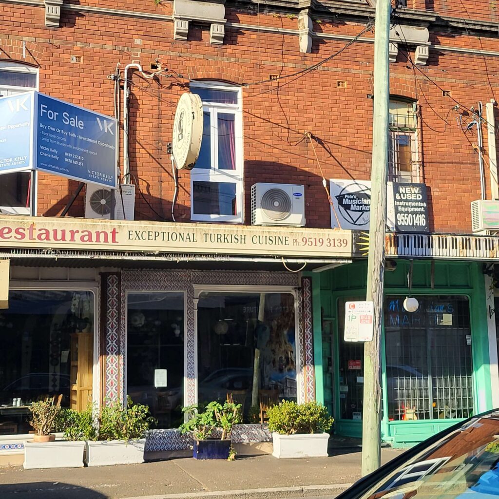
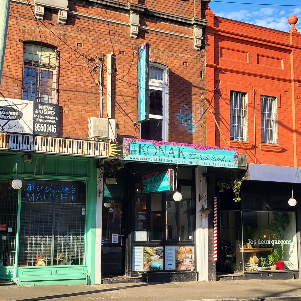
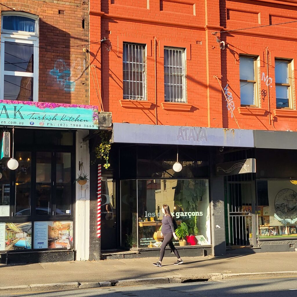
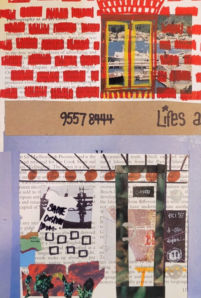
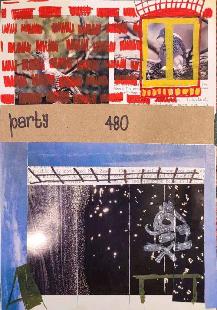
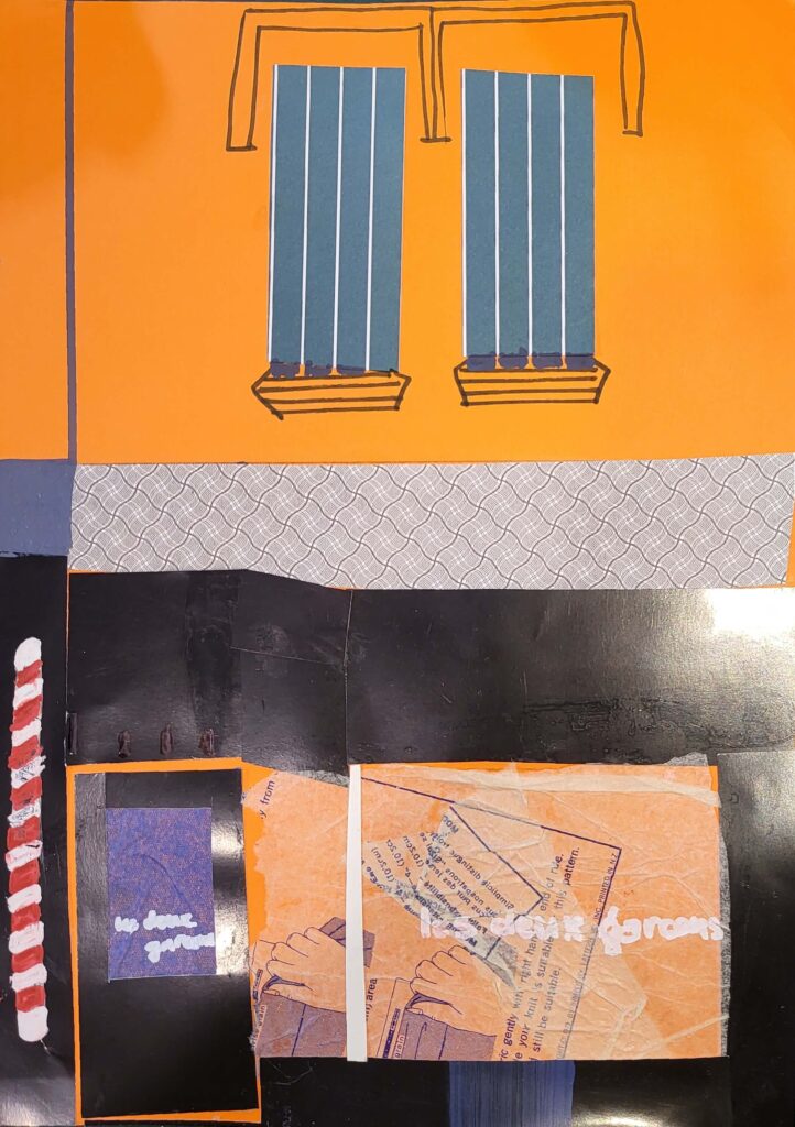
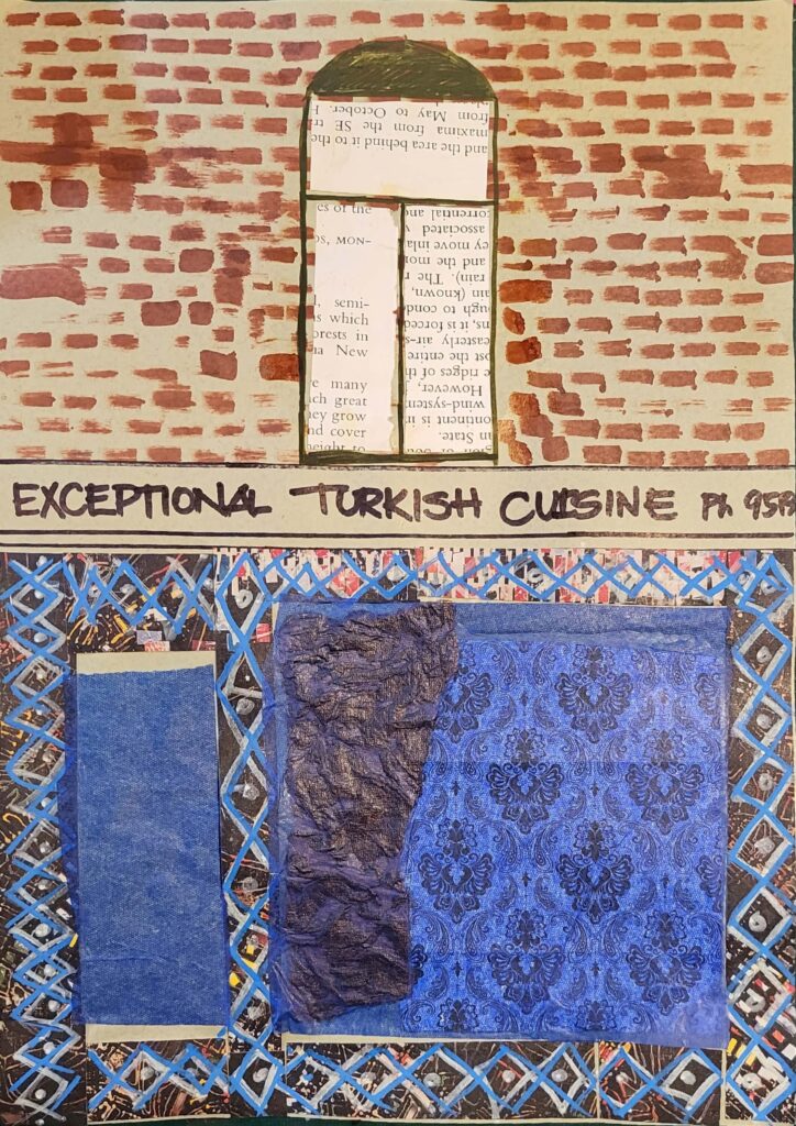
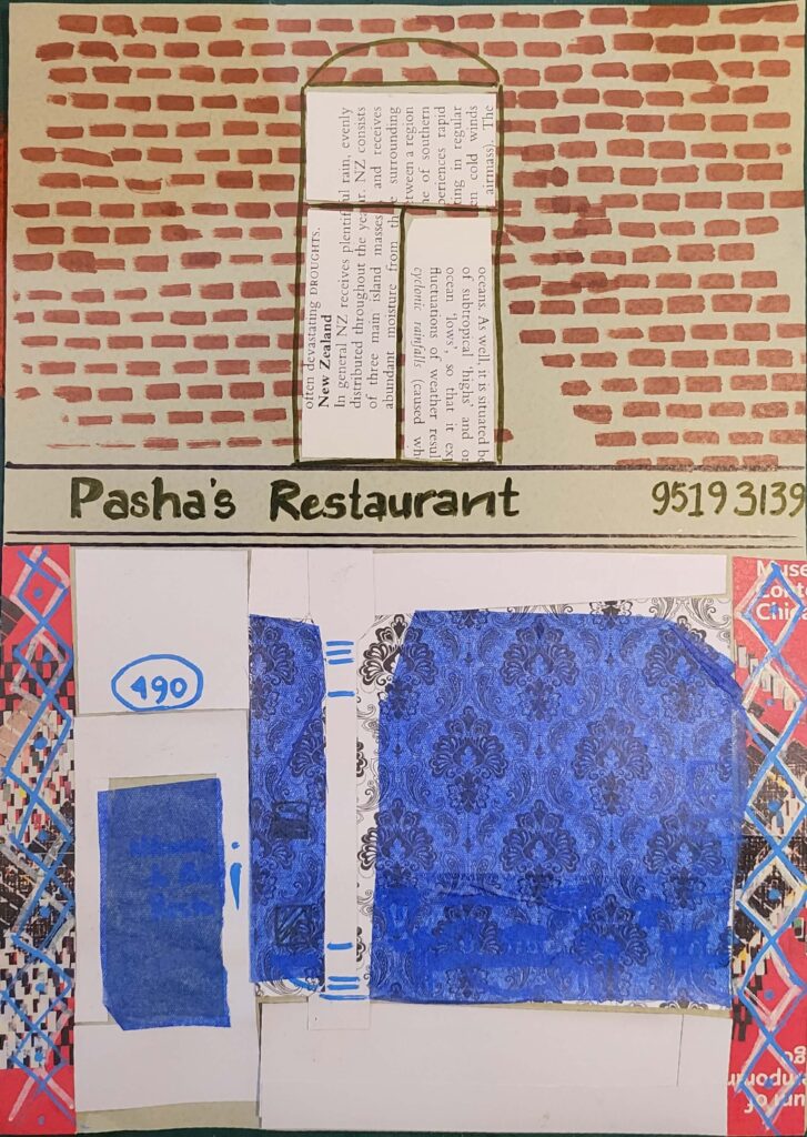
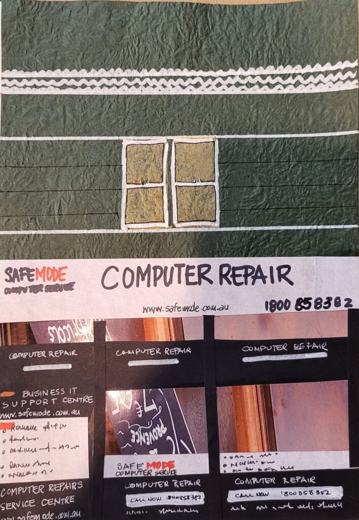
I have started a new series, collaging the shopfronts of Newtown.
I did a series years ago using bus tickets and outlining the shops of Newtown (and here). It focused on the building shapes, rather than the content of the shops.
This one was a little inspired by the shopfront images I keep saving to this blog.
Here are some first drafts, where I followed the colours of the actual stores, and put in most of the details (including some interior details visible through the windows).
These taught me:
- choose a palette
- remember it’s not about the shop! a photograph will show reality, i have granted myself a licence to just do enough to show the bits
- in an altered book I do not have to show through the original book (i started with an Australia New Zealand encylopedia I picked up at the shopping centre book exchange – the images were pedestrian)
- limit the detail – no matter how cluttered their shopfront is mine doesn’t have to be
I’m onto the next iteration of this series which you’ll see soon. I’m still working on it.
I did make a couple of brick pattern cricut templates on tyvek which will no doubt have uses well beyond this one (the 2nd set of shops has no brick pattern at all).

