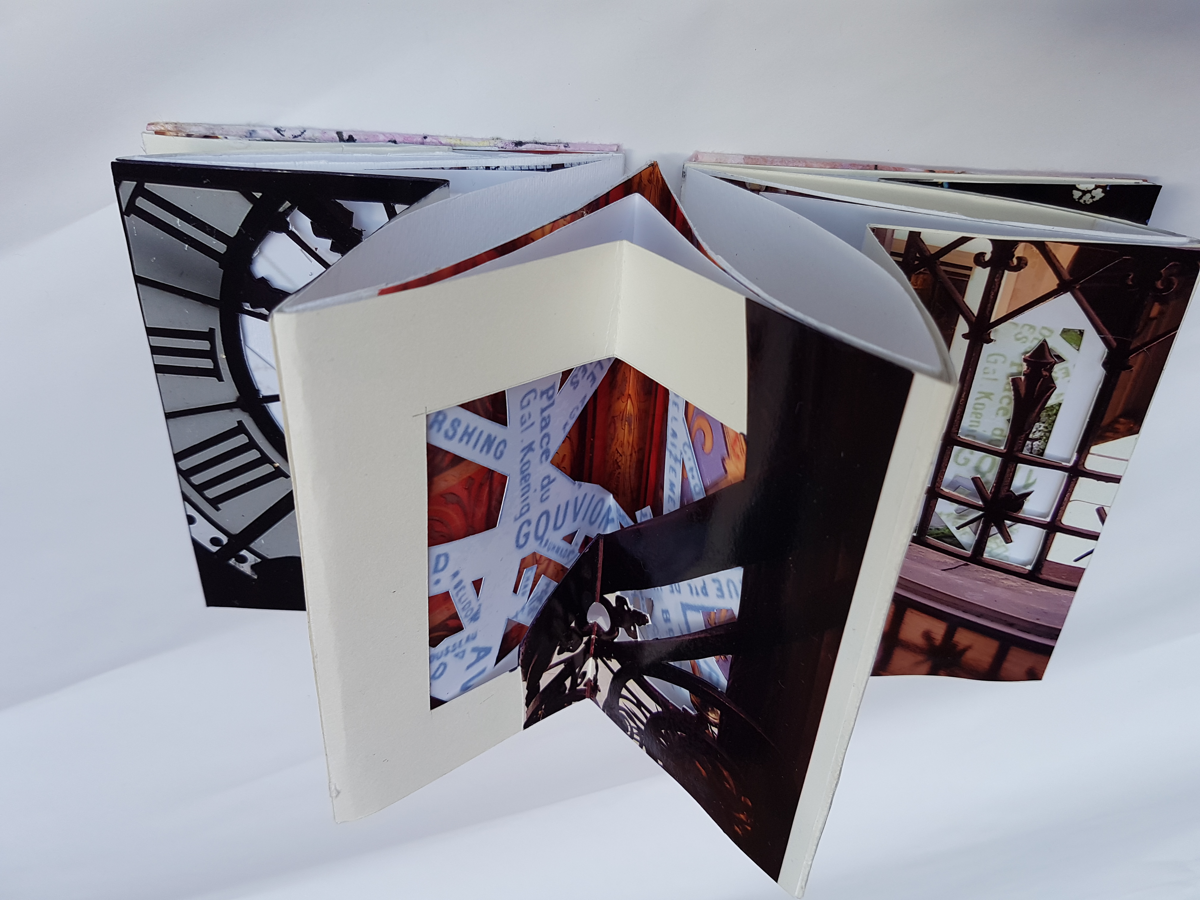
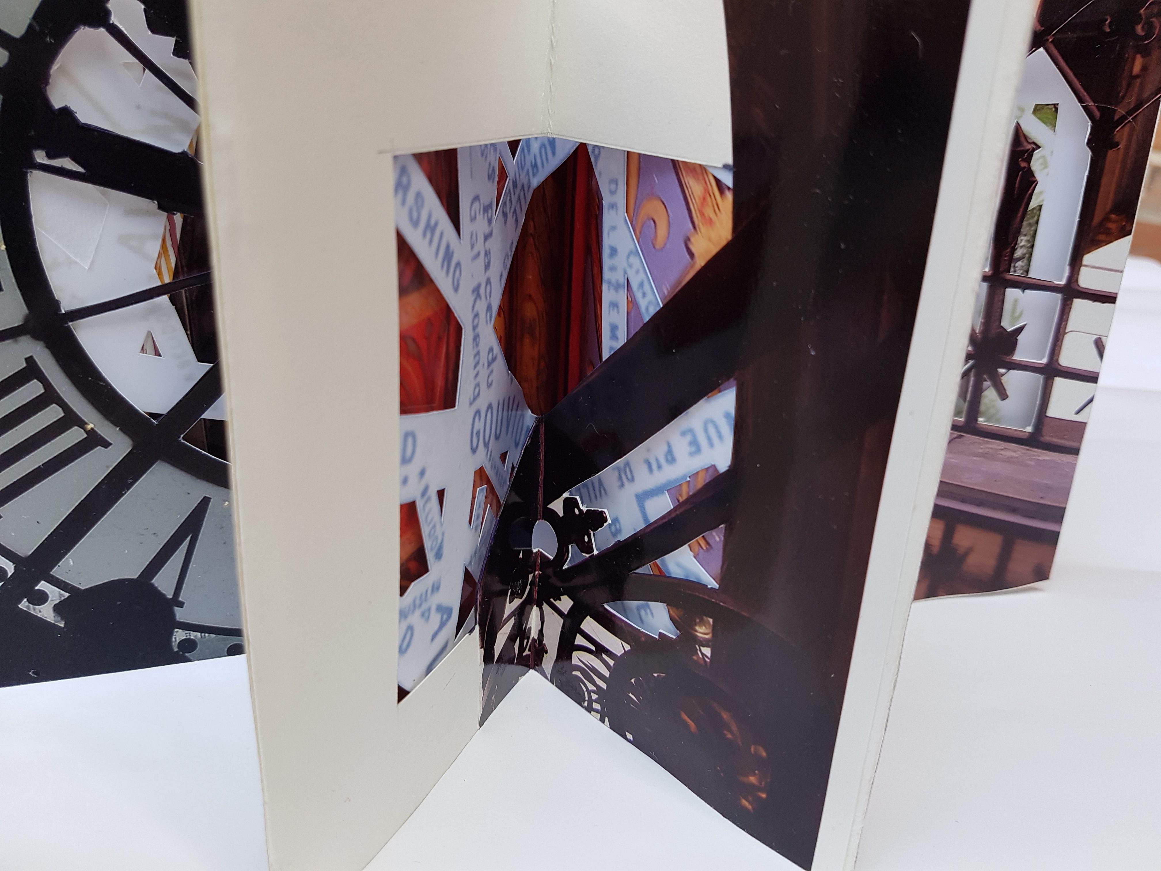
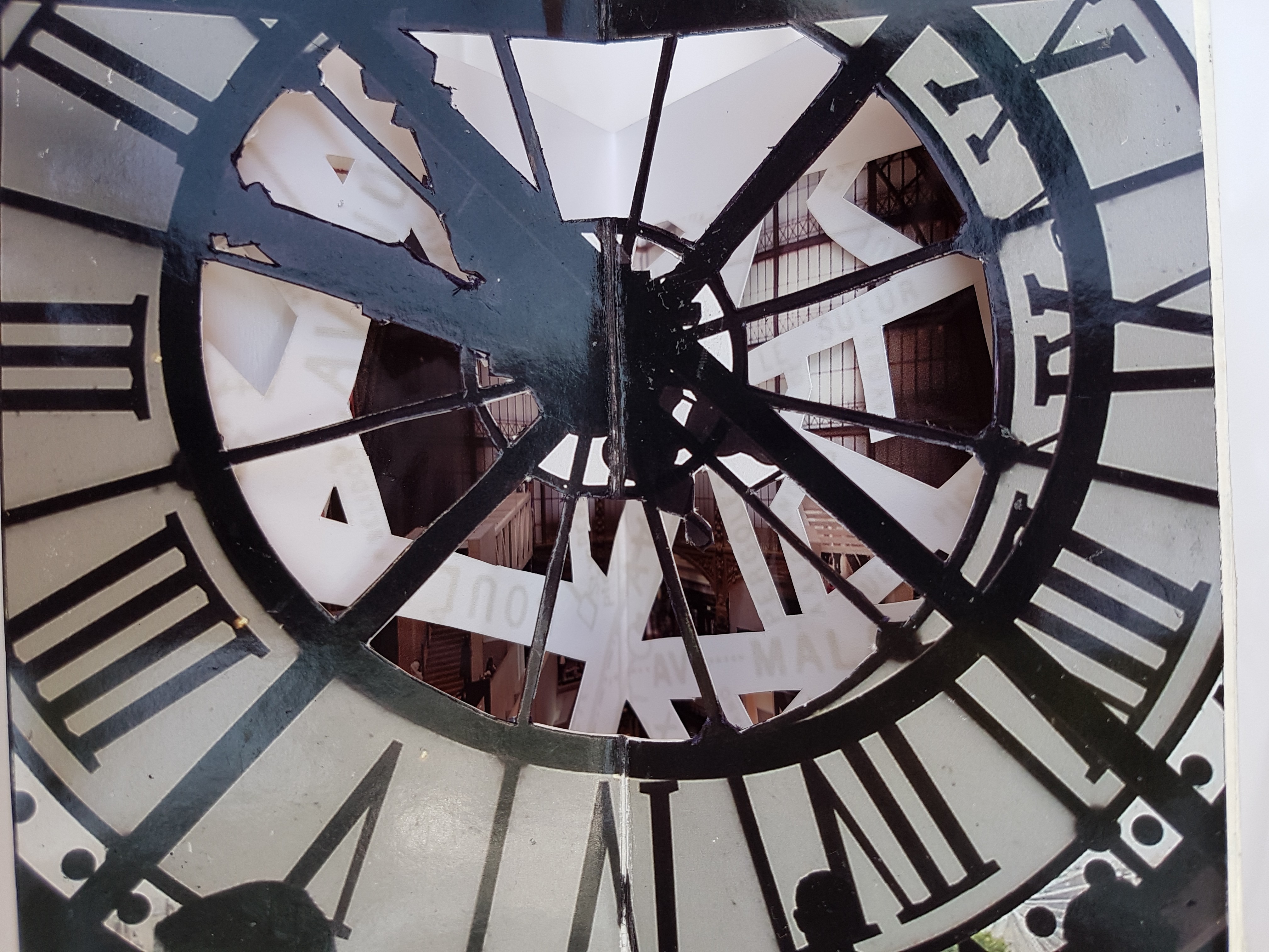
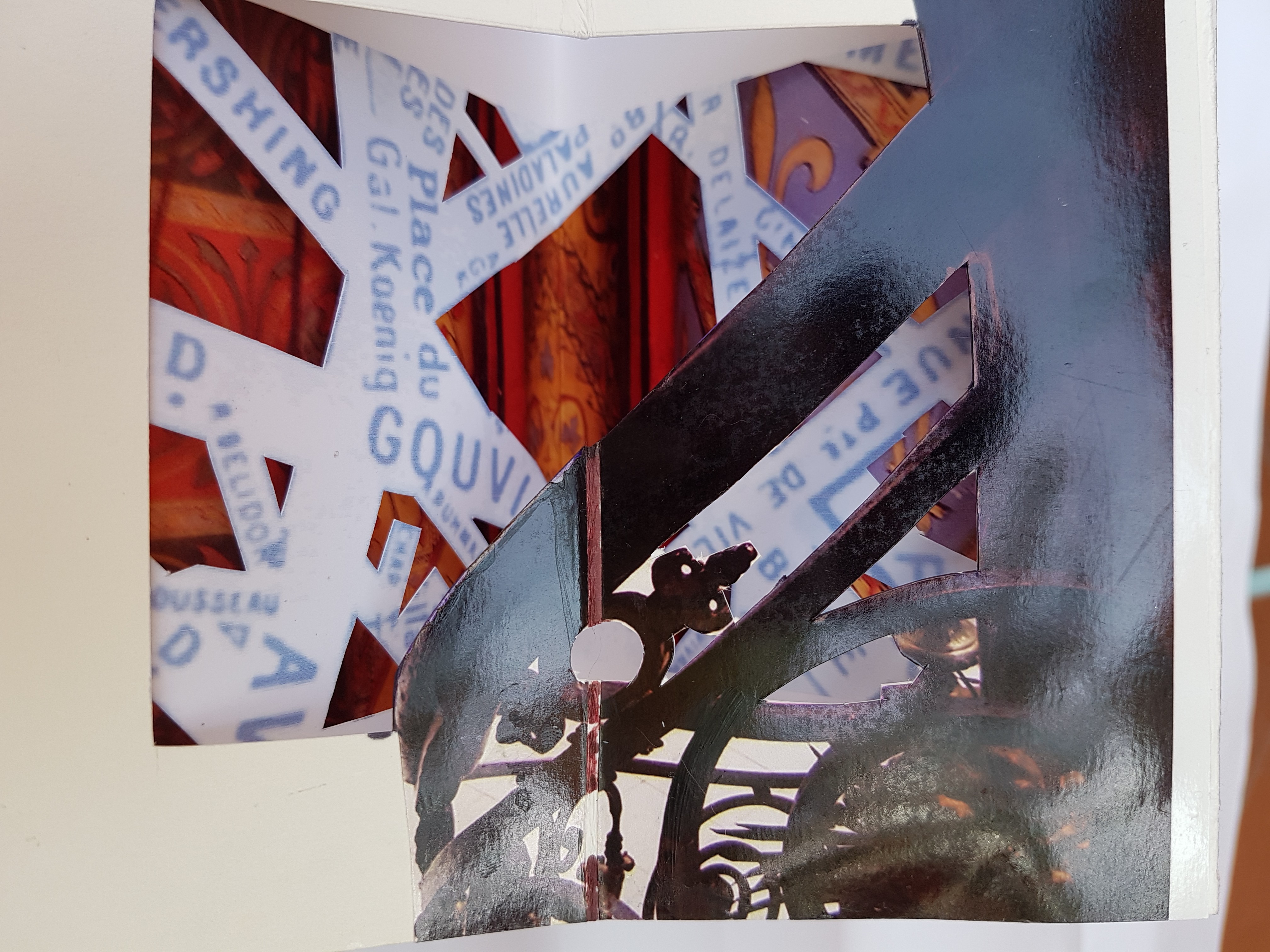
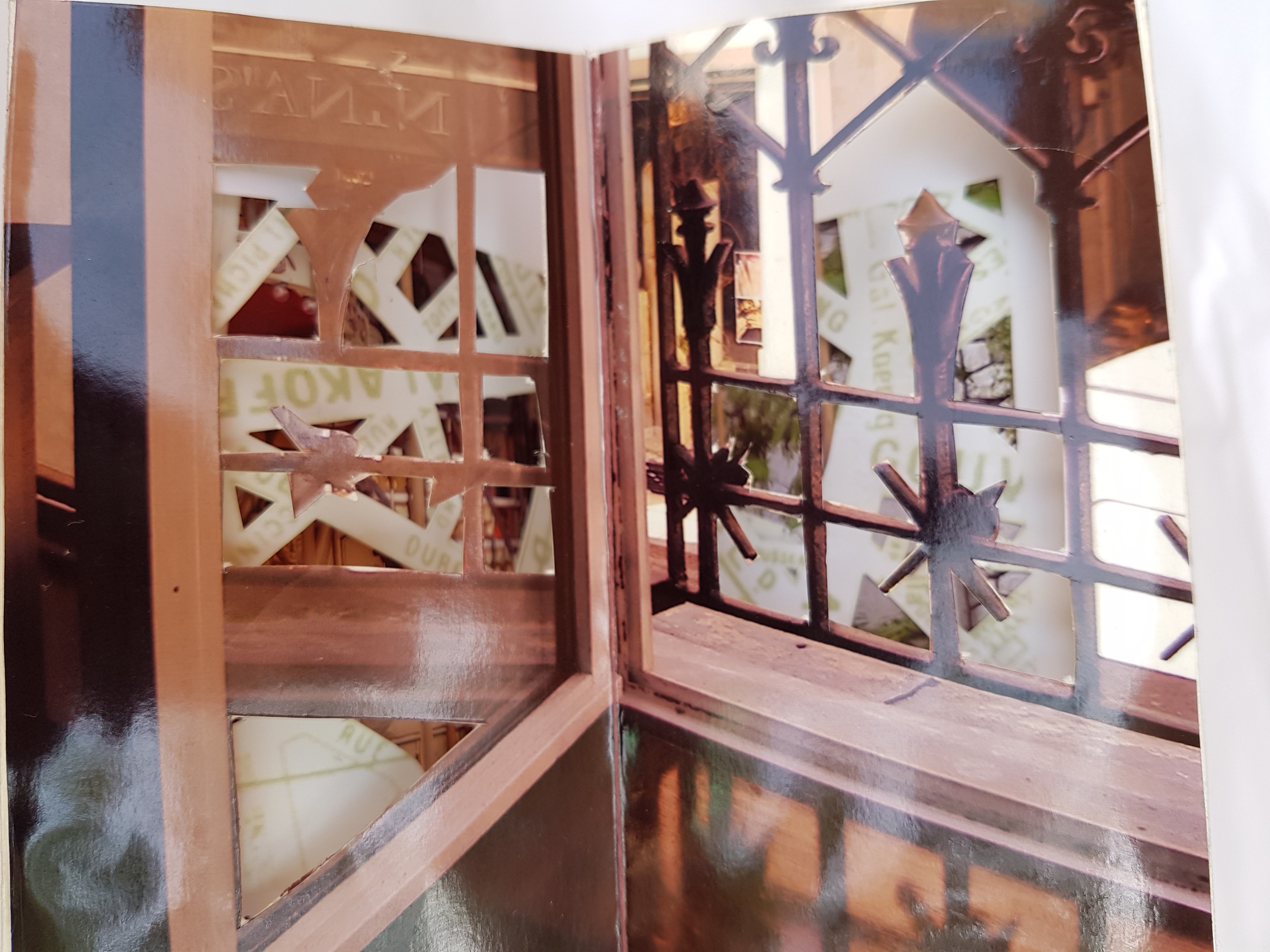
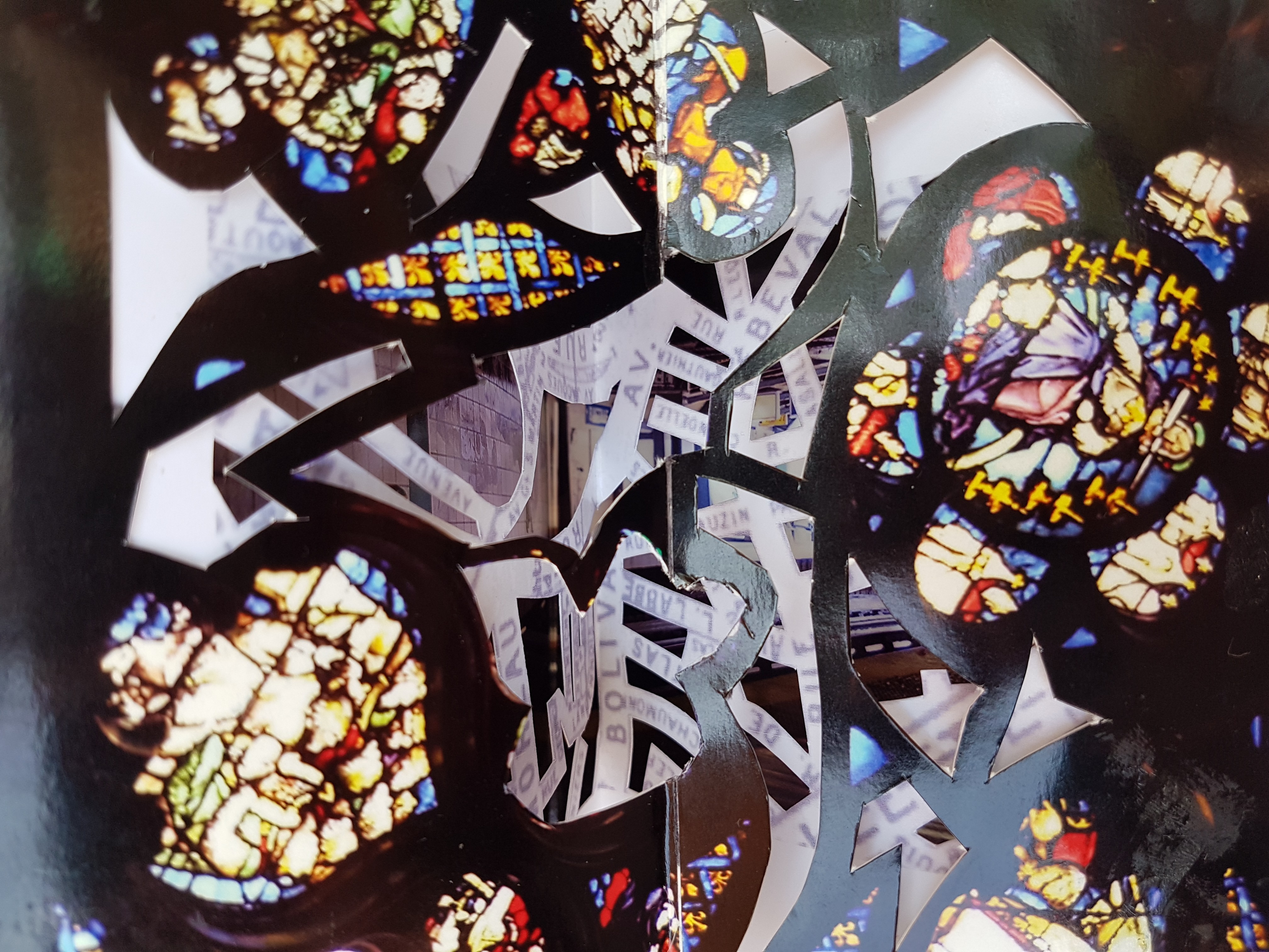
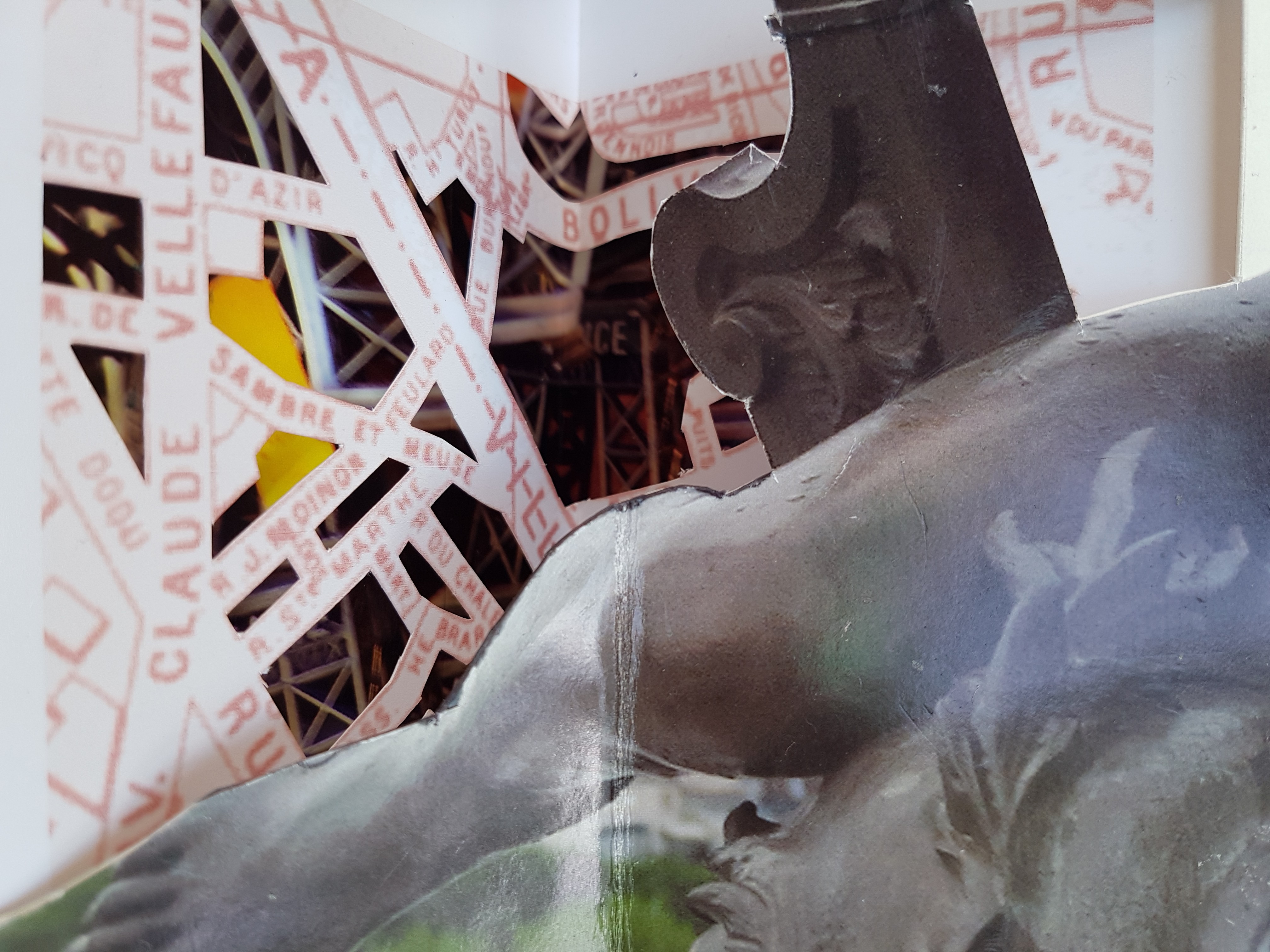
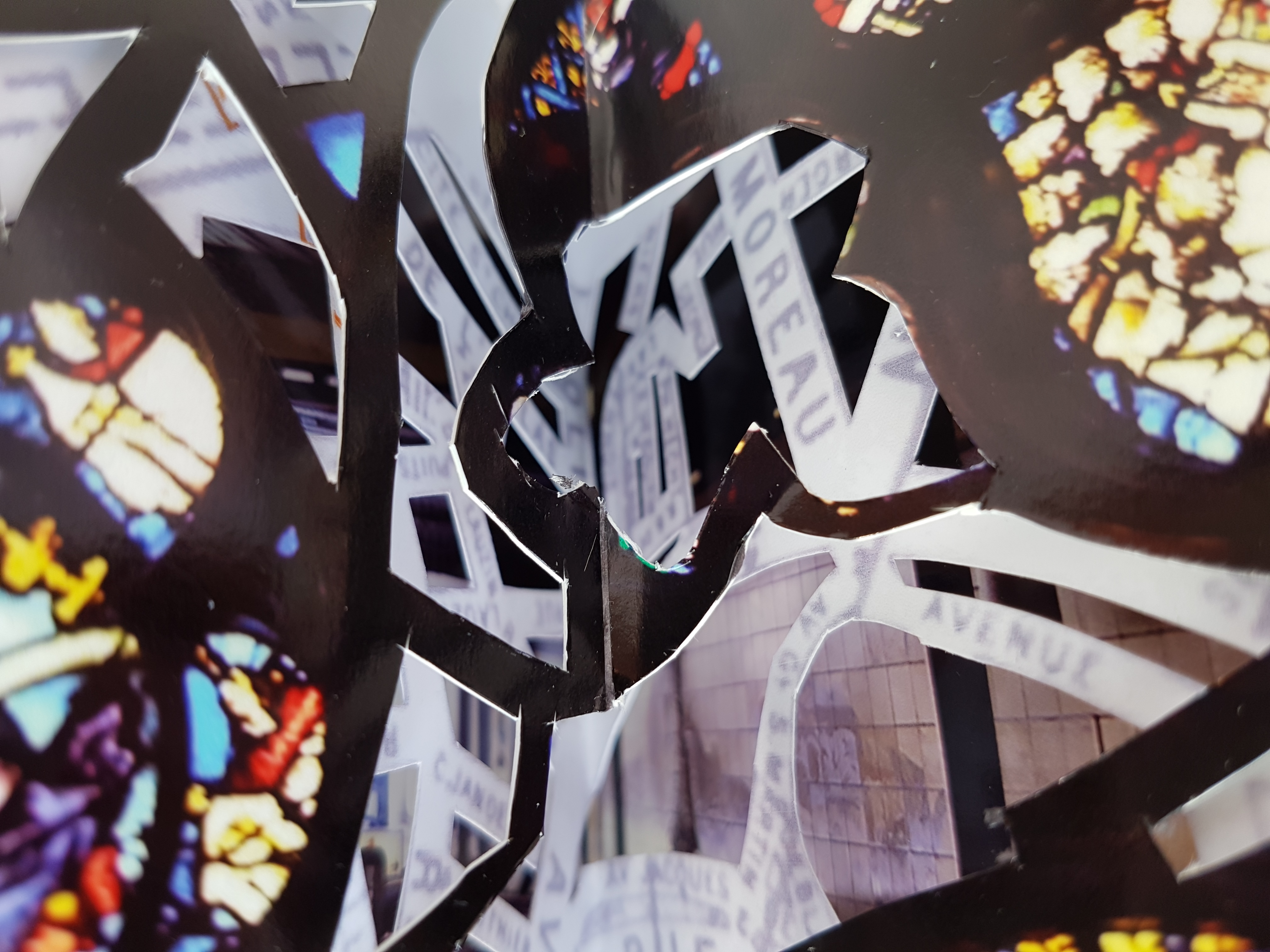
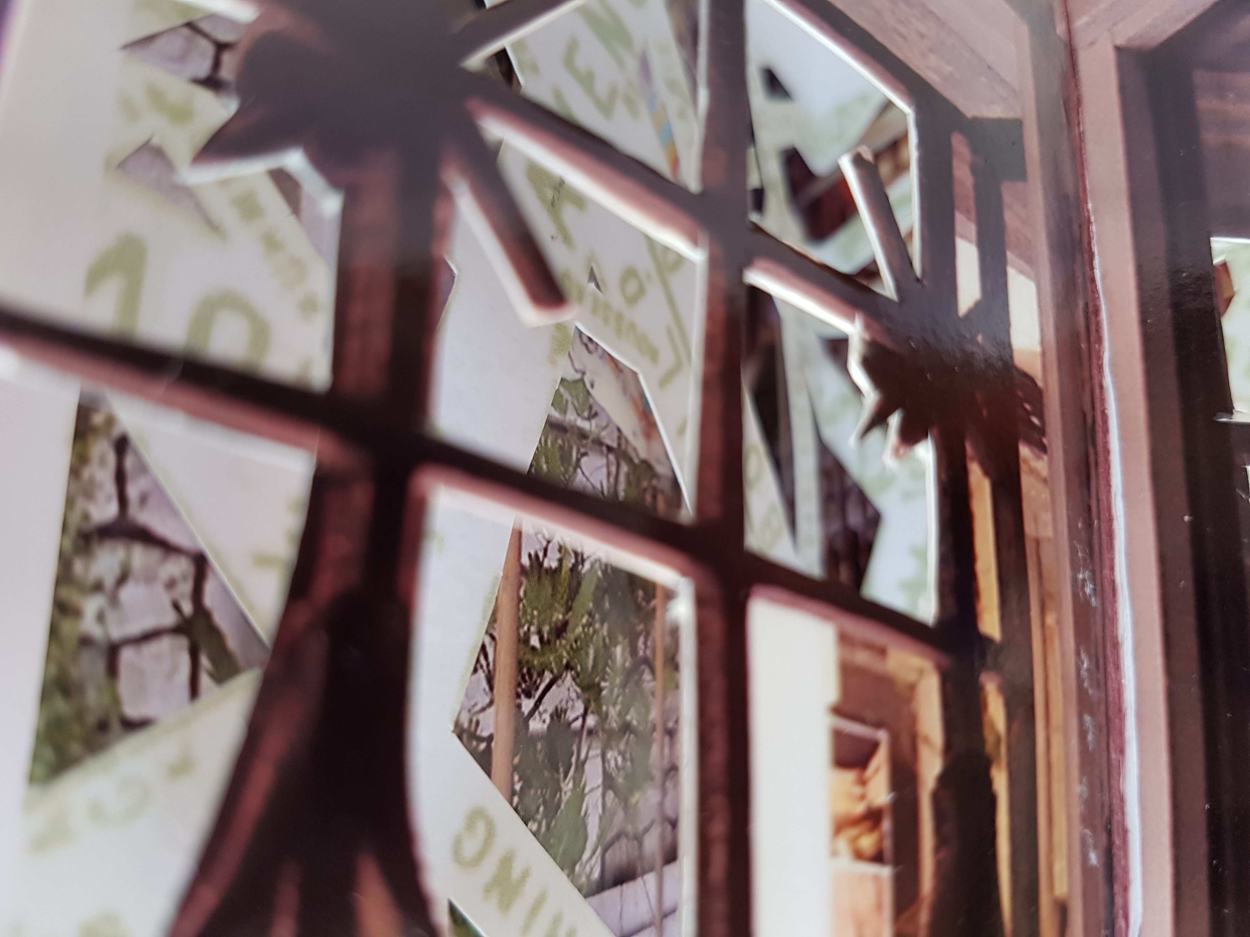
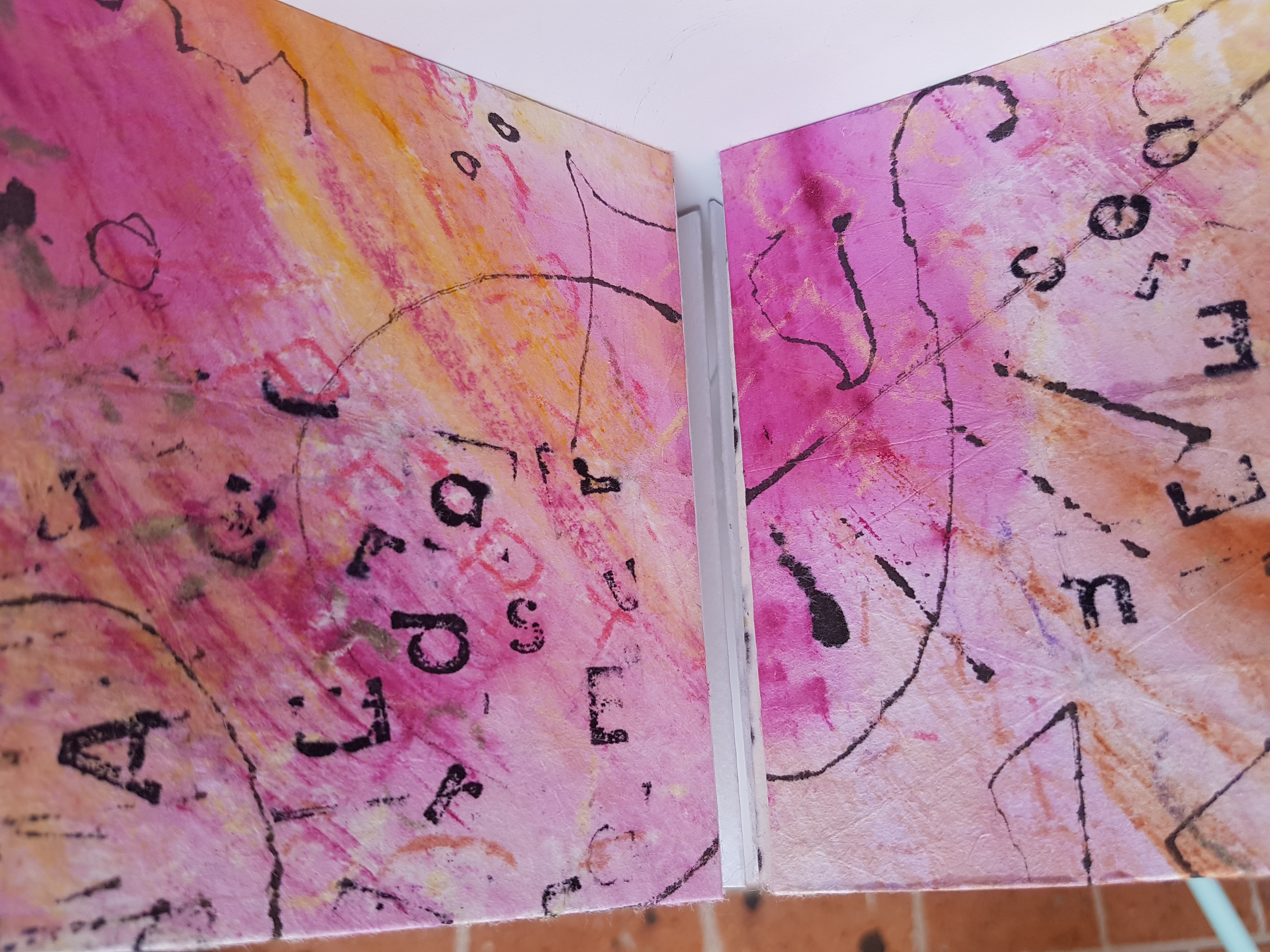
When I visited Paris in 2006 I went crazy with the camera. I had just completed a large Parisian collage made from my grandmother’s sheet music and I was eager to get more variety in my buildings.
Plus it was beautiful.
I printed out many of the photos, A4 size, and kept them in a book.
Fast forward to 2016, and I’ve taken up this nice carousel habit. Browsing my boxes of raw materials for some more adult content (Little Golden Books are wonderful, but I had maps and diagrams in my sights, and I will get there as well!) I found them.
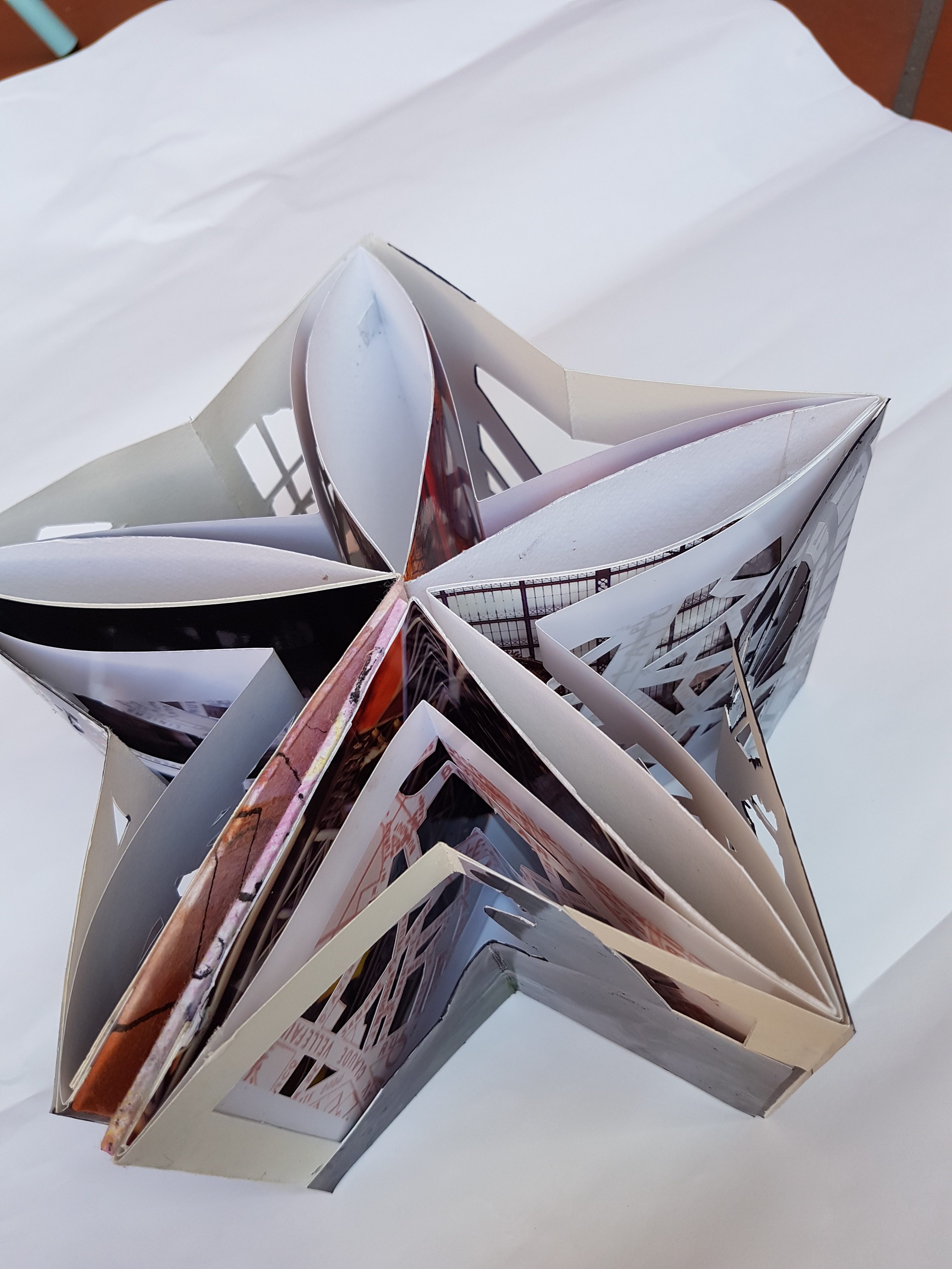
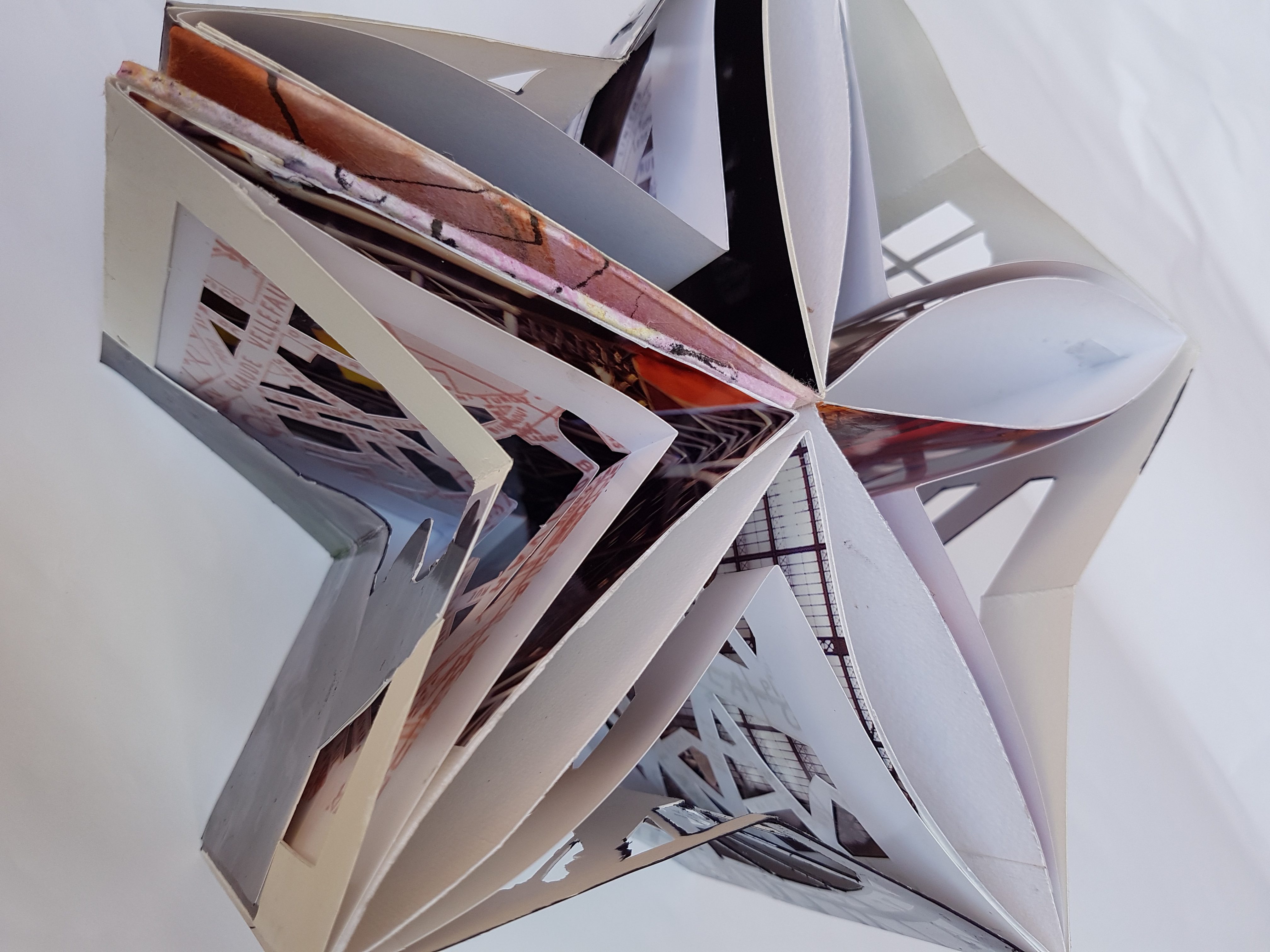
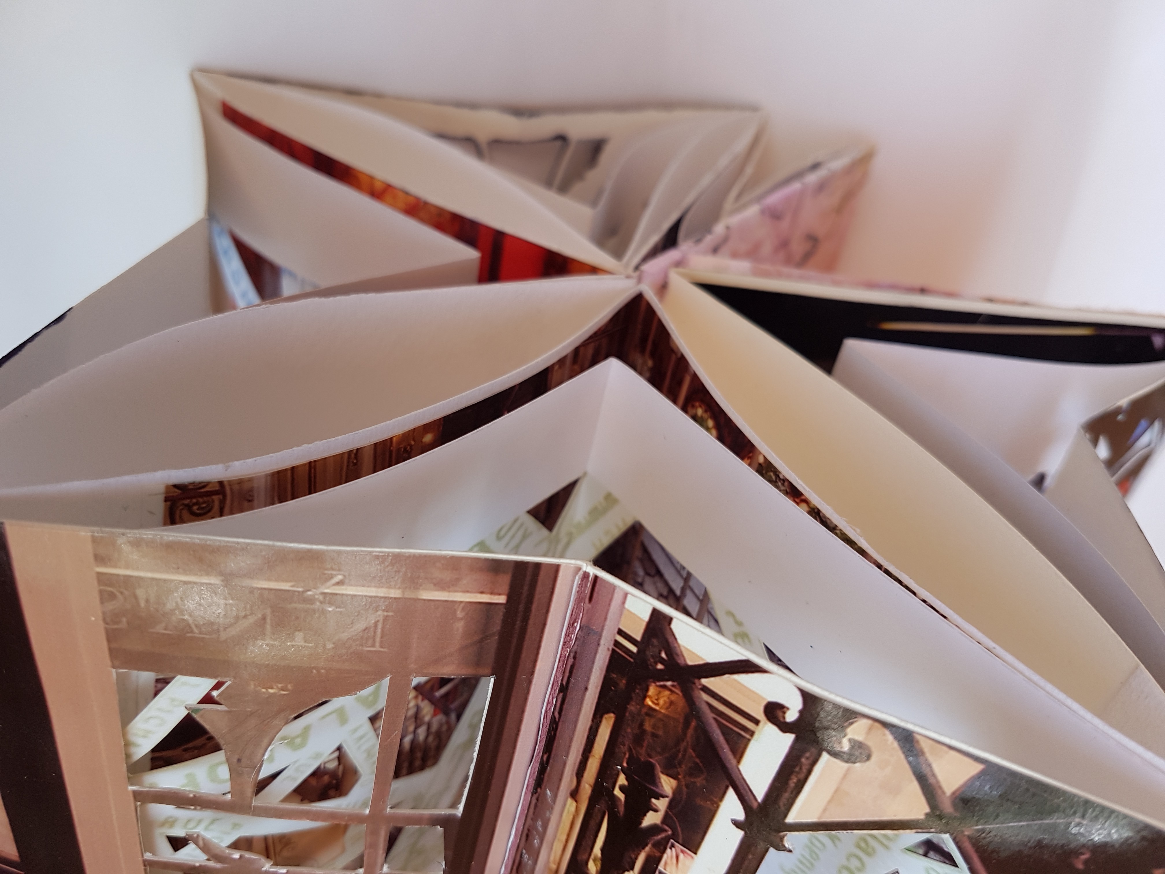
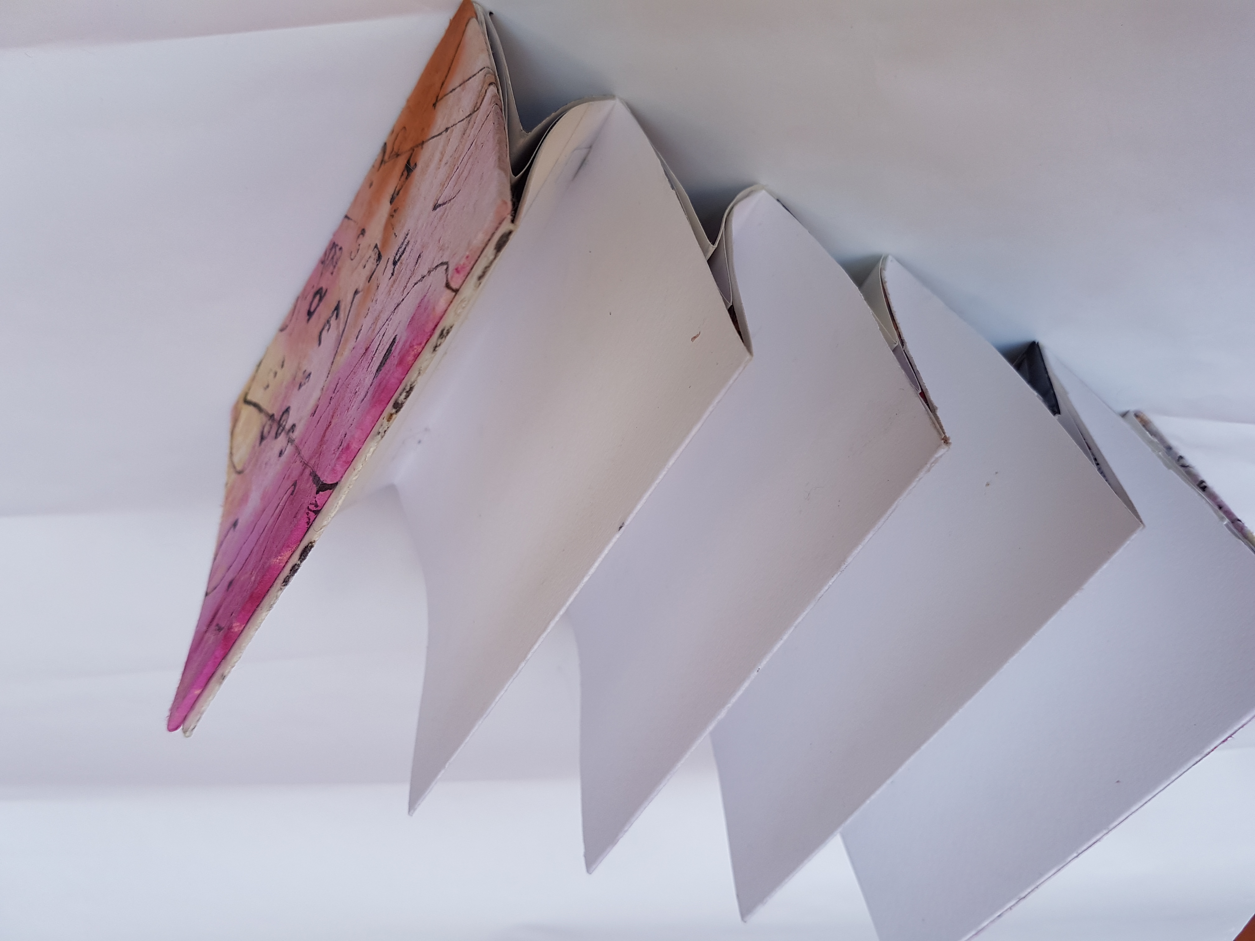
So here are some of them, Carousel-ed. 14 x 12cm as for all of my current carousels (easy to store, looks great on the shelf, and displayed they look like they go together even if they don’t).
‘
I learnt a lot from this Carousel.
- if people will see the frame of the carousel then use the same type of paper for each layer at the minimum
- tennis elbow and cutting doesn’t go well together
- photographic paper is robust enough without being backed for a carousel, but if you do back it then see number 2 above… and realise it will make the carousel tighter
- measuring works but it’s not everything – on this one I made each layer smaller than the last (only the 14x12cm layer was measured), and it worked. If I had my time again I’ve had made the second layer looser, but the front layer works well
- make sure to pull the tabs really tight if the paper is slippery – this one has gaps between the layers
- remember the inner layer must be light enough to be seen – some of the beautiful images are obscured at the back because they are too dark – it meant i had to cut back the middle and front layers more than i wanted to, simply to get the light in
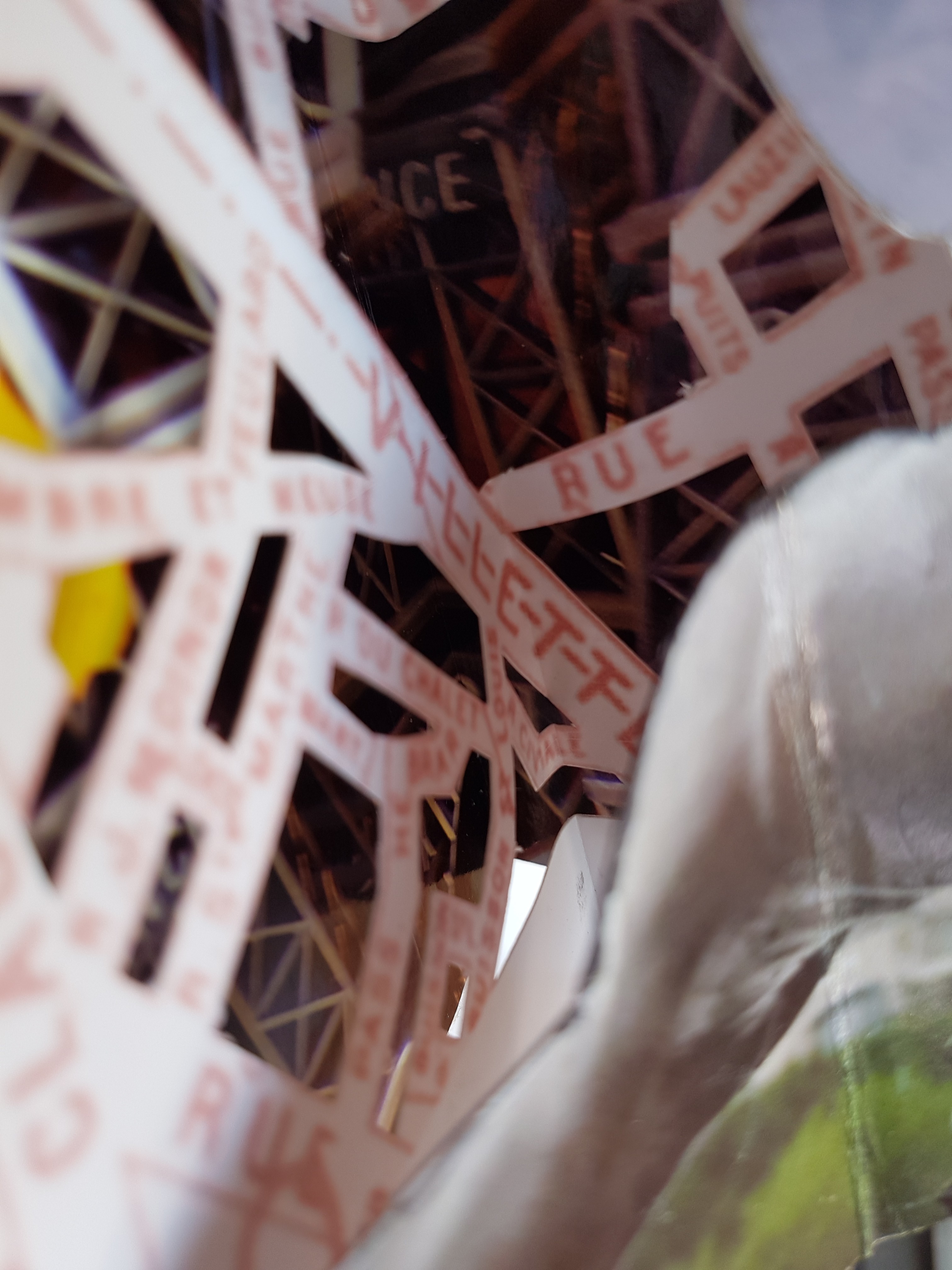
- I added a layer in the middle which was just a paris map (my plan de paris from when i lived in paris in 1989, scanned and played with, and then cutting out parts of the map to make it lace-like)
Thoughts on where I could go next
- more Paris (this one wouldn’t go together because it was too thick and the central layers were too dark, so I made a new middle layer, and so I have a second Paris one about to complete)
- Try a carousel with the same image on all 3 layers, maybe zooming in (or out) on each one
- try a carousel with the same image on every panel (combine this with 2 above and see what happens)
- try a carousel with a plain background but complex map or diagram cut outs on middle and outside – what about red in the middle, then a map of the heart blood vessels and on the outside a love letter or similar? or a brain one, or muscles? When I eventually get my World Book Encyclopedia back from the attic where they are stored there will be plenty of diagrams to play with.

