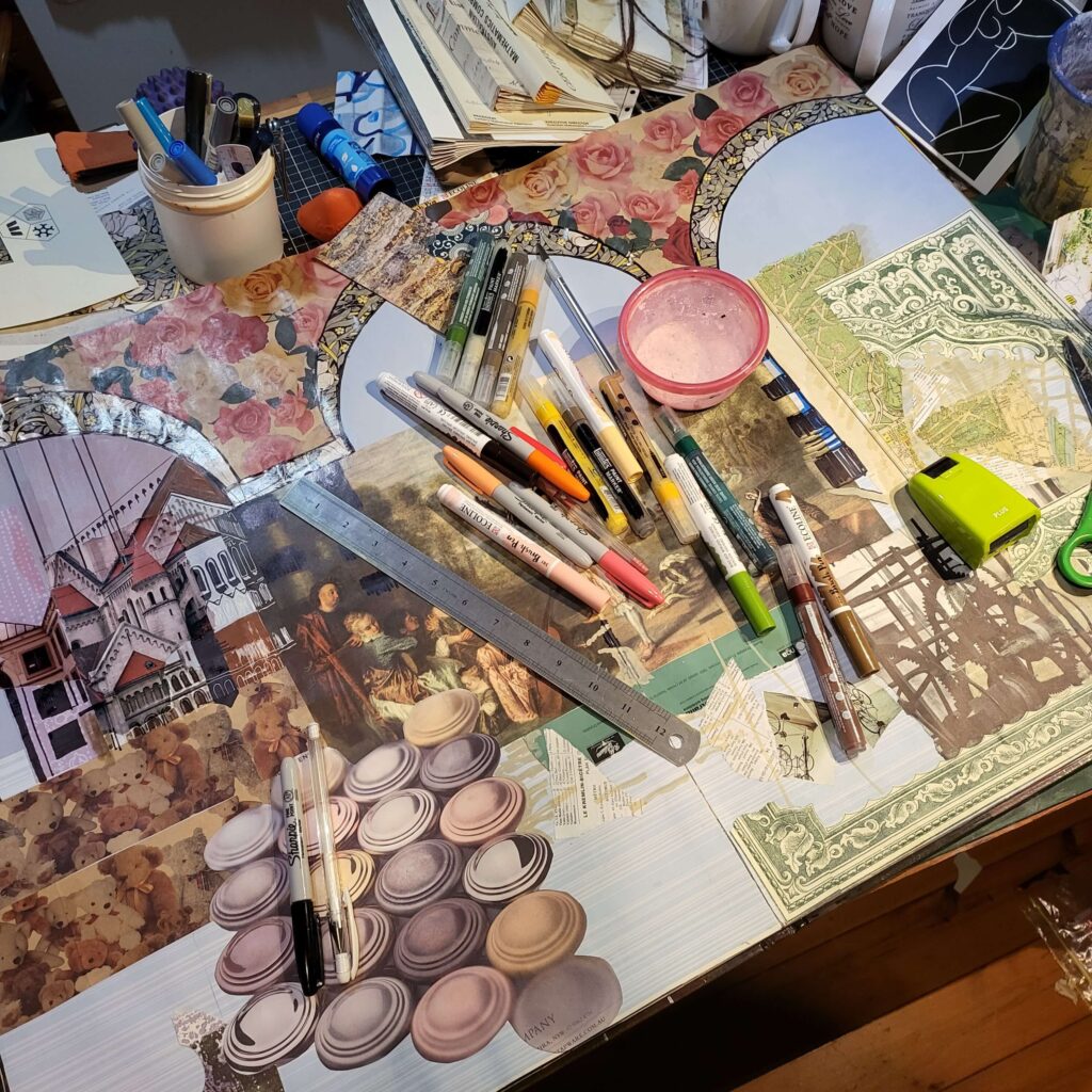
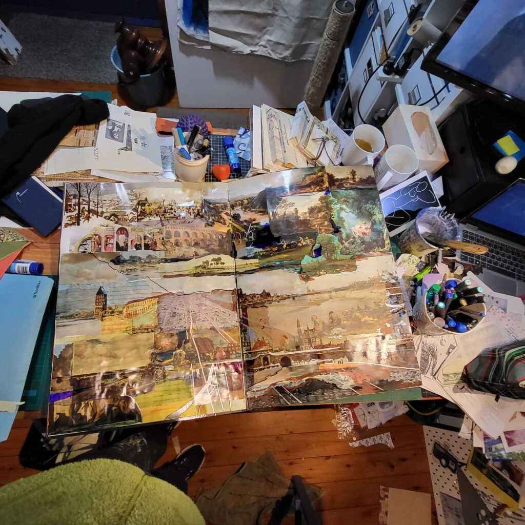
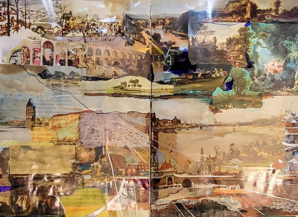
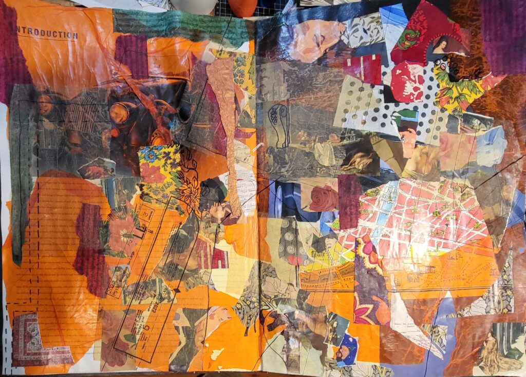
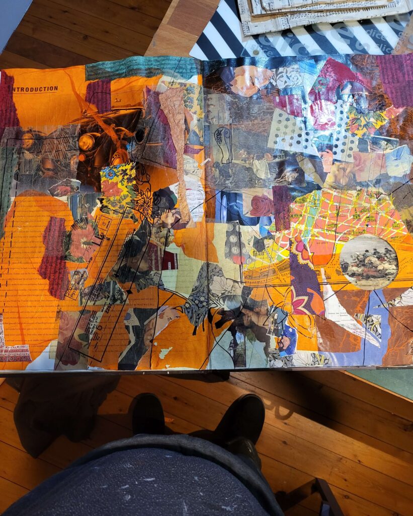
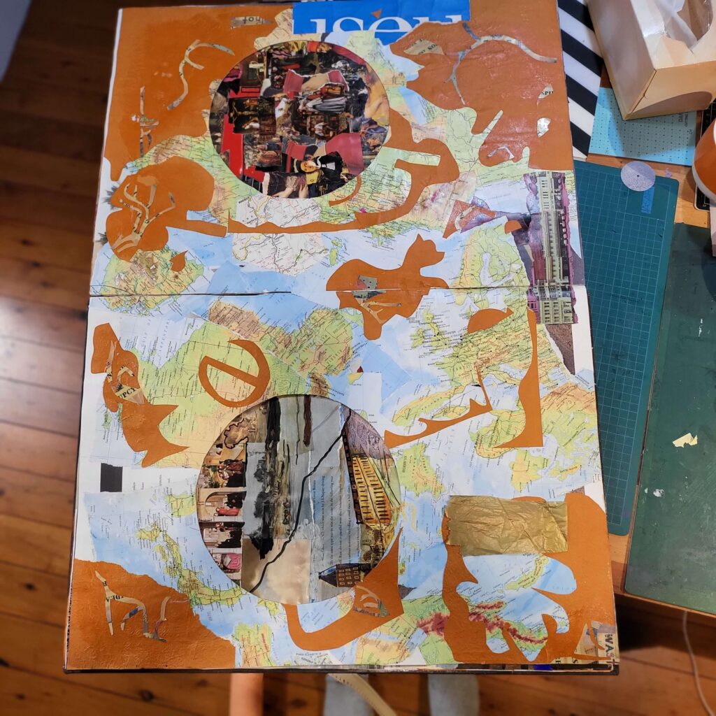
Been working on this 40 x60cm book quite intensely for quite a while (Sports Cars 1 was published 24 April, and it’s now 22 May).
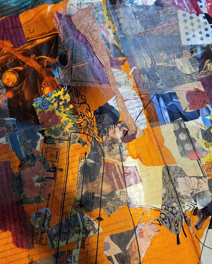
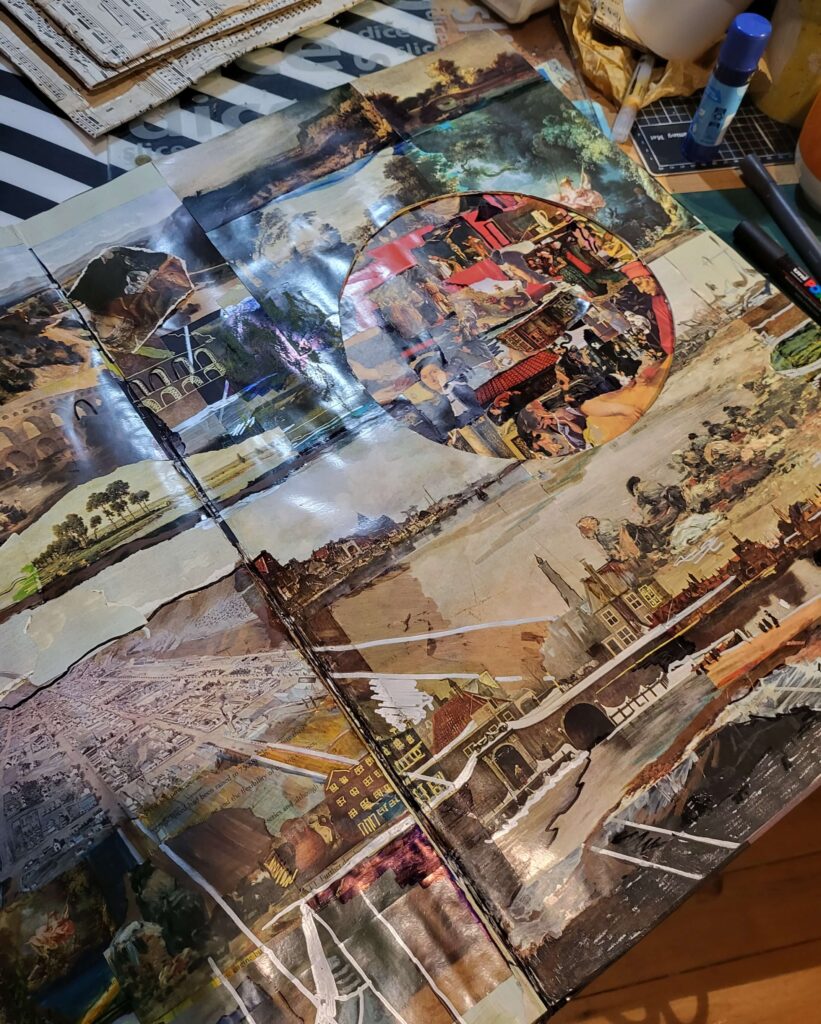
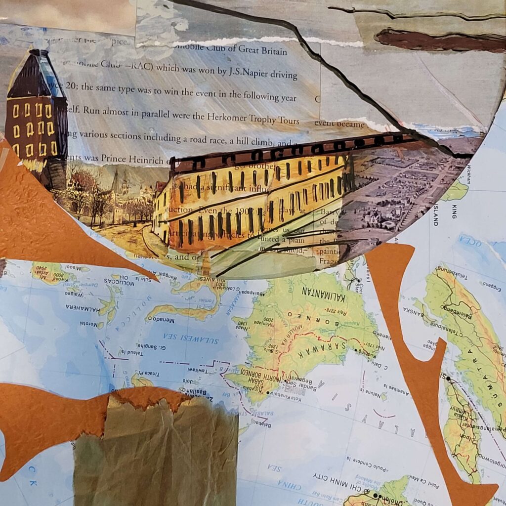
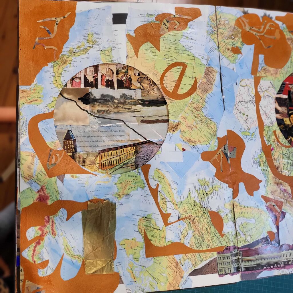
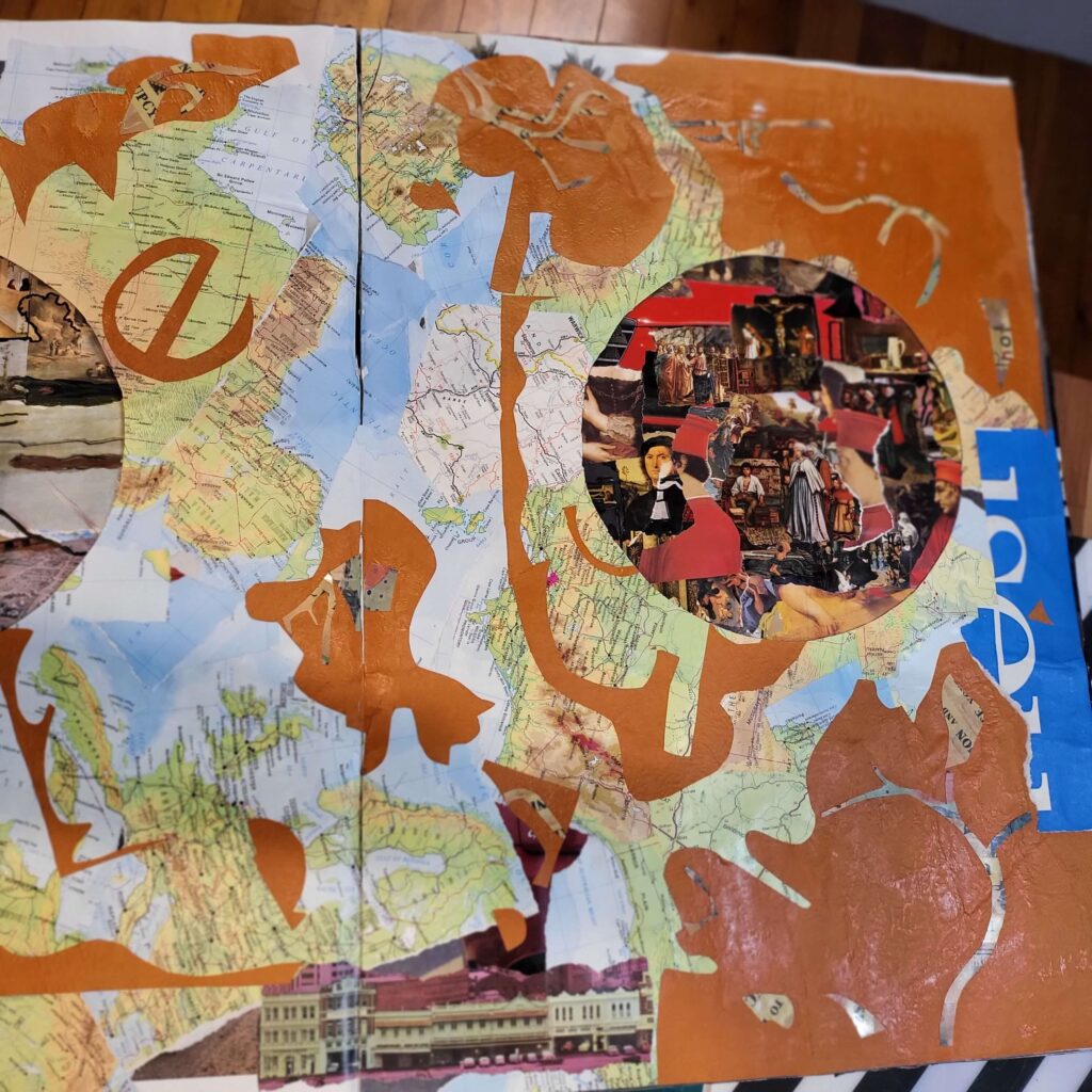
So here is an update. It is by no means finished. partly because I’ve begun cutting out peep holes / circles from one page to another, which means I’m having to re-do parts or pages to suit that – when a bright red piece shows through onto an orange page there’s some adjustment necessary.
I have only 2 unused pages left, but I did glue in the bones of 3 pages last week, and over the weekend found a moment to re do even what you see in the progress video below.
Some technical things:
- I removed the pages from the original book willy-nilly, rather than examining the binding, so i have had to reinforce some of the pages
- as a rule when i paste an image cross a page-spread I cut the image at the point i want it to join, because i know in the past my image gluing is not precise enough, but because of the page problem I’ve glued some of them across – let’s see what happens
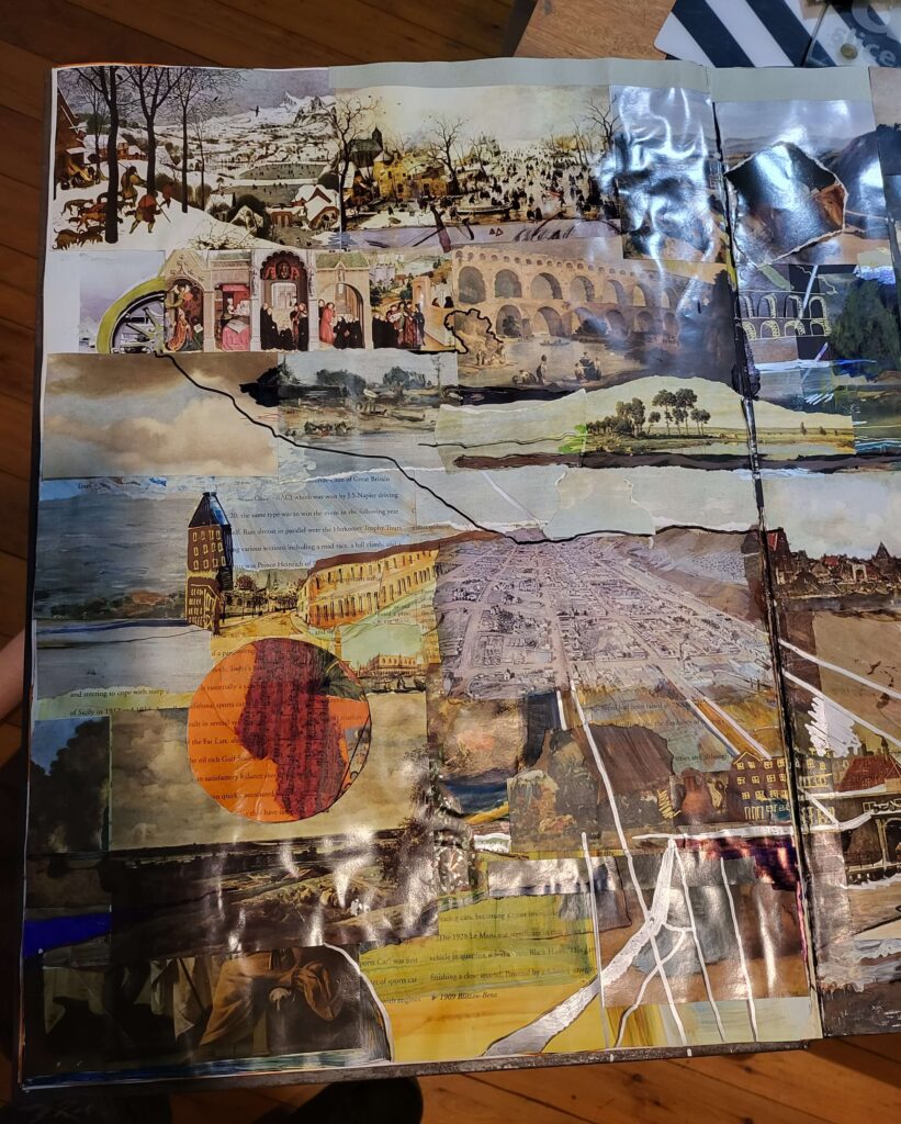
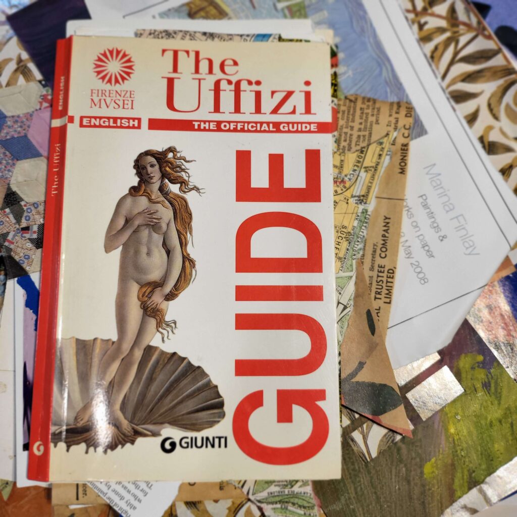
- like many altered books I didn’t know what it was about until about now, i.e. a month into working on it. Last few times I made a decision at the beginning of what it was about, and stuck to that (Clocks, Chairs and Airplanes, Electoral Boundaries Theme). This one I started out wanting to use the images from one of Betty’s Book of Art Encyclopedia which i just googled to discover it’s worth more than $500! maybe i should do that before cutting them up next time!). But when i brought the car book down from the attic i had already begun collaging. I could have remained true to my original idea, which i kinda have, but instead i hybrided with what was already there (the maps page, of which i say in the video “i need to change this” is the main page). So choosing a theme in advance means less work… but this is also about the puzzle of making it work (since the video i have added dress pattern tissue to the maps and cut some holes so it integrates with the other pages more effectively… that will be in Sports Cars 3).
- The pages where I mixed in other images (pictures i took in Paris years ago for example) have felt easier to me, and those images beside mostly being architectural are larger. The architectural aspect means I can extend the imagery and make that the focus, the size means i’m not micro-examining every image, which suits my style. There is a meditative element to the whole tjhing though, so a repetitive fleur-de-lys or a set of bookshelves can be quite good to do.
See more of my altered books here.
Here are more images of the work in progress (some taken so i could destroy slash improve the page).
